How to brand a President
How do you brand a potential President?
Presidential candidates - their campaign branding could mean the difference between 4 years in the oval office and being just a wikipedia entry. Historically presidential candidates use the Red, White and Blue of their star spangled banner to retain something quite “American”, as though there’s already a brand in place that candidates need to conform to. There is, however, a growing trend for candidates to move away from the traditional Red, White and Blue towards a more personalised colour scheme.
This year, 3 candidates in particular stand out - here’s our review.
Elizabeth Warren
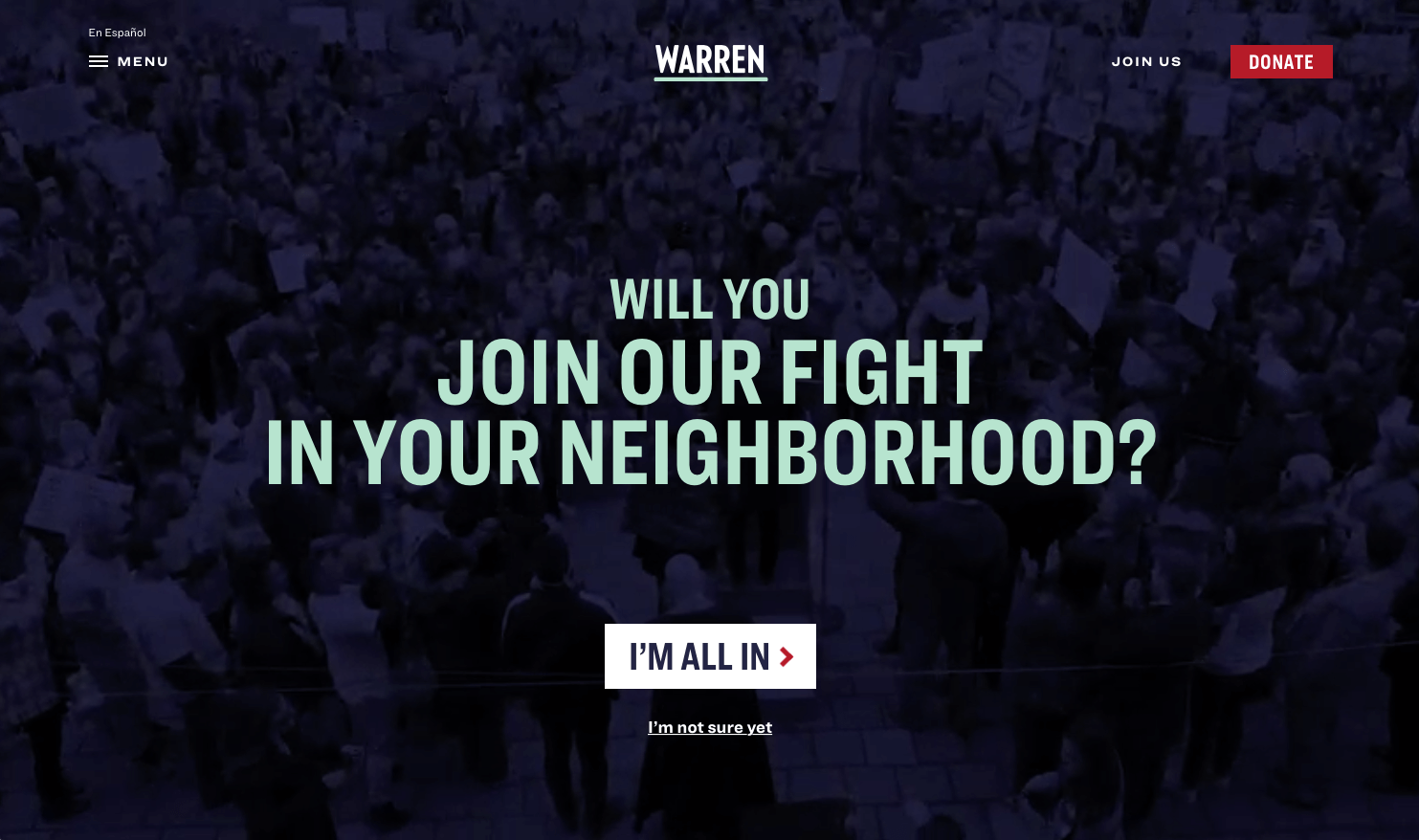
In a break from the norm the use of Blue has disappeared and instead a deep purple has been applied - when paired with a calming mint green and white, the identity is bold, fresh and smart, which does a good job of representing Senator Warren’s straight talking politics. With a well recognised name as being the main component the logo, the identity works very well overall. The colour scheme has been accented with a deep Red to retain the link with tradition, which supports the theme nicely. The website utilises the colour hierarchy well and it remains a distinct and different identity then everyone else. The downside to Senator Warren’s brand is the negative connotations in her type - The home page is all about the need to fight and while the fight is for nice things, the idea of having to fight for anything creates a negative overtone that could be her undoing. It would be nice to see a message of progress and hope, though perhaps a fight is what america needs at the moment.
Kamala Harris

The is our favourite Identity, even though not our overall brand winner. Kamala Harris has adopted a very eye catching identity - the use of bright Yellows paired with the subtly different burnt Orange and Blueish Purple (these colours retain some of the the “expected” branding for presidential candidates) it is a refreshing brand to see (perhaps taking a leaf out of the campaign design adopted by AOC in 2018). The slogan is also a tried and tested three word slogan - “For the people” - which is easy to remember and catchy. It is targeted at the whole of the USA, so leaves no-one out. Bold typography and a neat layout for the website, it has a quality “stand out” feel to it.
Pete Buttigieg

But the stand out Winner - is Pete. Several aspects of Pete’s campaign are simply better than the competition - The colour scheme is bold but not too corporate, the typography is contemporary and the website is simple and neat. But there are three key features for Pete’s campaign that sets it apart from everyone else.
Firstly, it’s personal to the people - the logo includes reference to the Jefferson Blvd Bridge in the town he is currently mayor in AND the team have created state specific banners for people to use under the title “Team Pete”. In addition, in a fresh move, the whole campaign centre around the use of his first name which makes him approachable and less “corporate” - Not only a smart one, but great tone of voice. The entire campaign website does not bear his surname anywhere - other than reference to his surname using a way of remembering how it is pronounced (“Boot Edge Edge”), he simply wants you to remember his name - Pete. It puts everyone on first name terms with Pete. It’s friendly. And it works.
Secondly, it’s personal to him. Given that people don’t buy what you do they buy why you do it, any opportunity to weave your "why” into your brand is a vital move. Each colour in the colour scheme has a background story and meaning to it. As well as endearing links to pets, the colours and backgrounds used are references to him, his family, and the town he is mayor. The brand includes references to the very people he is supporting which will resonate well.Though most will roll their eyes at the meaning behind a brand identity, the fact Pete has publicly stated all these reasons will only bring him closer to the people.
Thirdly - and here is a killer feature - the entire brand identity has been made available to all supporters by supplying the design toolkit to everyone. Gone are the days when people felt the need (or rather, had no choice) to bastardise the existing brand by making something up that resembled the brand but wasn’t the brand, the entire toolkit has been made available to everyone to generate their own support banners. Typography hierarchy, colour schemes, layouts, logos, the lot. It even has a banner generator where anyone can choose from one of a number of banners, apply the colour scheme of their choice and print it. Where once a brand required to have tight and close control over what gets issued, the Pete campaign gave the rules and tools to the people and they can now push content out using the exact right brand identity. The community feel to this brand is simply amazing. Brilliant work from Hyperakt.
Which is your favourite?