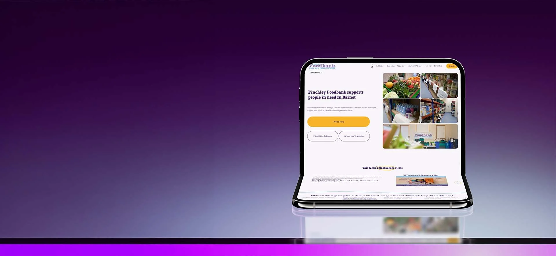
Finchley Foodbank: a website that works as hard as its volunteers
A full re-platform to Squarespace 7.1 for a registered Barnet charity, built from custom wireframes and extended well past the template with bespoke CSS and code.
THE CHALLENGE
A foodbank website has three very different visitors arriving at once. Someone in crisis who needs food today. Someone who wants to donate. Someone who wants to give their time.
The person in crisis is often on a phone, sometimes on borrowed data, and has no patience for clever navigation. They need opening hours, the address and what to bring, fast. Barnet is one of London's most diverse boroughs, and many visitors speak English as a second language.
On top of that, the foodbank held a 30-page support guide covering benefits, housing, energy, mental health, domestic abuse and more. It was valuable, but locked in a document few people would ever open. And the site had to be easy for a small team of volunteers to keep up to date long after launch.
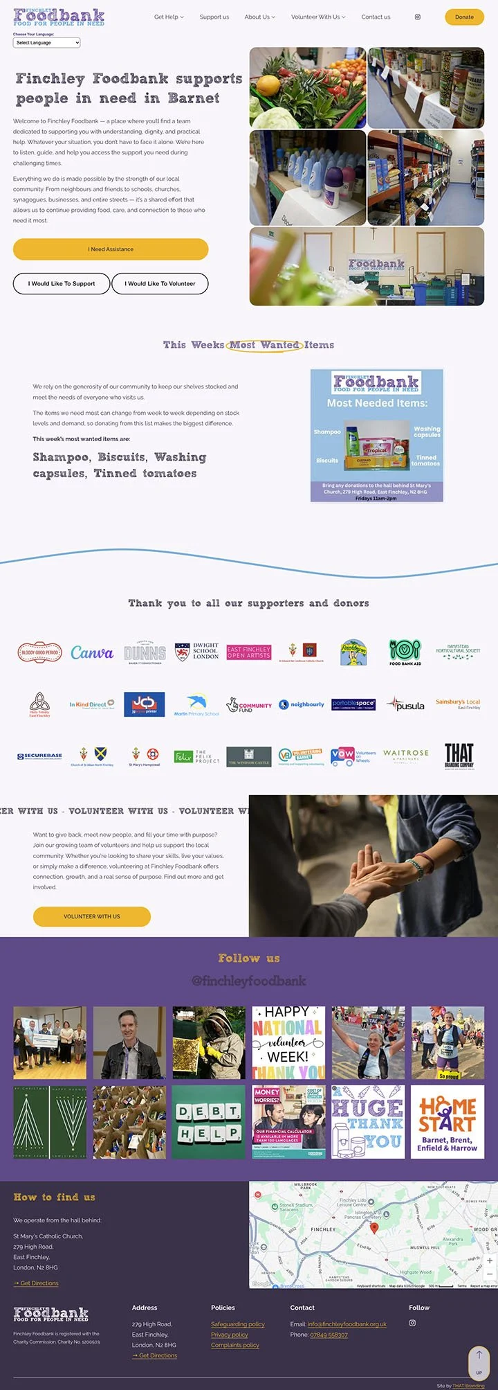
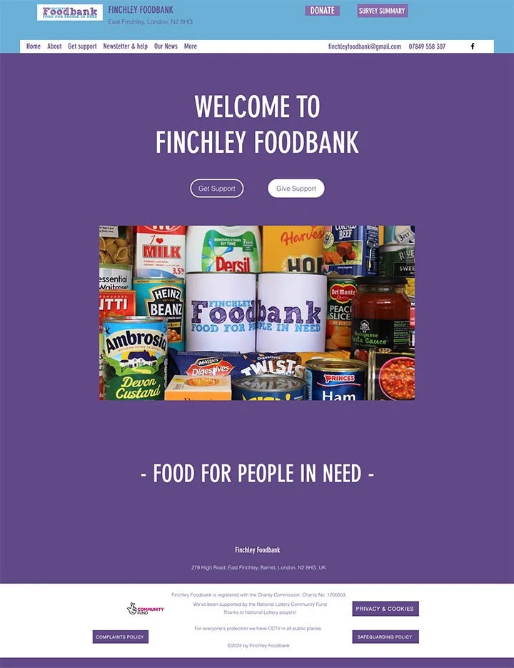
Old Site
New Site
Structure and UX
Every decision started with one question: who is this person, and what do they need in the next ten seconds?
Three doors on the home page. "I need help", "I would like to donate" and "I would like to volunteer" sit above the fold. Each visitor self-selects and lands on a page written for them.
Mega menu navigation. Get Help, About Us and Volunteer each open a mega menu, so deep content is one click away without a cluttered header.
Practical detail first. Opening hours, a step-by-step registration process, what to bring and a one-tap directions link sit high on the Get Help page.
The support guide, rebuilt as a directory. I restructured the 30-page document into around 20 categorised entries, from financial help in Barnet to support in community languages. Summary blocks with category filtering mean volunteers add or edit an entry once and it appears everywhere it should.
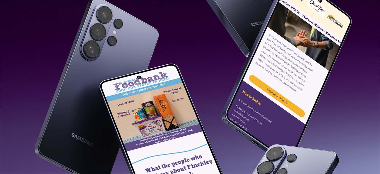
A live "most needed items" feature. Donors see what the shelves are short of this week, updated by the team in seconds rather than by a developer.
Social proof that carries weight. Short quotes from the people who use the foodbank do more to explain its value than any mission statement.
Beyond the template: custom code
quarespace got the charity a platform their volunteers can run. Custom code got them a site that doesn't look or behave like a template.
Bespoke site search, so a visitor can type "energy", "housing" or "baby milk" and land on the right help, without needing to understand the site structure.
Customised Google Translate integration, implemented from the core Google tool and styled and configured to sit natively in the site, so visitors can read every page in their own language. For a multi-ethnic community, that is the difference between finding help and giving up.
Mega menus built into the native Squarespace header, with anchor-linked sub-sections so visitors jump straight to the right part of a long page.
Multi-page sections, so shared content such as "How to find us" and key calls to action is written once and reused across pages. One edit updates the whole site.
Bespoke CSS across navigation, list sections, summary blocks, buttons and footer, refining spacing, type and hierarchy well beyond the style panel.
Responsive tuning at every breakpoint, with mobile treated as the primary experience because that is how most people in need arrive.
Clean, maintainable code, commented and organised so the next person to open it can follow it.
Design and assets
The visual approach is warm, plain and dignified. Nobody visiting a foodbank wants to feel like a case study.
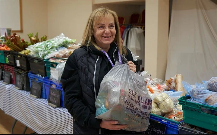
Real photography of the hall, the shelves and the produce, so visitors know what to expect before they arrive.
A custom map pin graphic and directions links to the hall behind St Mary's Church.
Logo variants prepared for light and dark backgrounds, plus branded social share images for every key page.
Image optimisation across the site to keep pages light on mobile data.
Handover and training
A charity site is only as good as the team's confidence to run it. I trained the foodbank's volunteers hands-on, covering:
Compressing and preparing images before upload
Editing list sections, summary blocks and category filters
Managing the mega menu and anchor links
Building forms, including lightbox forms and file uploads
Password-protecting draft pages for internal review
Checking every change on mobile before publishing
I also handled site ownership transfer to the charity's IT lead, separating ownership from day-to-day admin access.
The outcome
People in need now find hours, location and registration steps in one tap. Anyone can search the whole site or read it in their own language. Donors see exactly what is needed this week. A 30-page guide became a living directory the volunteers update themselves.
The less visible win is confidence. The team owns its website, and the charity looks as organised and trustworthy online as it is in the hall every Tuesday and Saturday.